为什么您的深色模式看起来不太对劲?
2026年4月12日 · 5261 字.md
根据 MDN 的说法 prefers-color-scheme 能够侦测到用户在操作系统上的主题偏好,也就是浅色和深色模式。
The
prefers-color-schemeCSS media feature is used to detect if a user has requested light or dark color themes. A user indicates their preference through an operating system setting (e.g., light or dark mode) or a user agent setting.
通常,我们可以通过媒体查询在写 CSS 的时候控制全局的主题变量。比如,我们可以写出下面的代码:
:root{
/* light mode goes here */
}

@media (prefers-color-scheme: dark) {
  :root{
  /* dark mode goes here */
  }
}
这样,页面主题可以自适应用户的偏好而自动切换。原生组件也可以自适应。例如浏览器的滚动条,您可能没有注意过
通常,我们可以通过设置 color-scheme 来控制可用的主题,例如:color-scheme - CSS | MDN
:root {
  color-scheme: light dark;
}

@media (prefers-color-scheme: light) {
  .element {
    color: black;
    background-color: white;
  }
}

@media (prefers-color-scheme: dark) {
  .element {
    color: white;
    background-color: black;
  }
}
其中 color-scheme: light dark 告诉了浏览器尊重用户的主题偏好来控制主题的显示。举一反三,如果设置 color-scheme 为 only light 或 only dark 就覆盖了用户的主题偏好,转而显示单一主题。
看起来很不错,但是,在实际应用角度上,原生的 CSS 似乎显得有那么力不足。有的时候,我们需要给出一个切换主题的按钮,这个按钮要覆写掉用户原生的主题偏好。
一般的做法是使用一个 .dark 类,通过添加或移除这个类,可以手动的控制页面的外观主题。例如,在 Shadcn UI 中,有这样一行代码:
@custom-variant dark (&:is(.dark *));
对于 Next.js 框架的项目来说,有一个成熟的解决方案是用 next-themes 这个库next-themes - npm,这个库封装好了 ThemeProvider ,只需要包裹一下主要部分就可以轻松使用。然而,我们在使用 React Router v7 或者类似的框架的时候,由于 UI 库本身没有自带 ThemeProvider 或者我们是手搓的 UI 没有封装好的组件,我们似乎不得不自己或者让 LLM 造一个轮子,用于主题的切换。一个常见的思路是用 JS 向 html 标签添加或移除 dark 类:
function toggleTheme() {
  const root = document.documentElement;
  const isDark = root.classList.contains("dark");

  const nextTheme = isDark ? "light" : "dark";

  localStorage.setItem(THEME_KEY, nextTheme);
  applyTheme(nextTheme);
}
聪明一点,我们顺带加上 localStorage 的持久化存储:
const THEME_KEY = "theme";

function applyTheme(theme) {
  const root = document.documentElement;

  if (theme === "dark") {
    root.classList.add("dark");
  } else {
    root.classList.remove("dark");
  }
}

function getSystemTheme() {
  return window.matchMedia("(prefers-color-scheme: dark)").matches
    ? "dark"
    : "light";
}

function initTheme() {
  const saved = localStorage.getItem(THEME_KEY);

  if (saved) {
    applyTheme(saved);
  } else {
    applyTheme(getSystemTheme());
  }
}
然后在 HTML 中渲染一个主题切换按钮:
<button onclick="toggleTheme()">切换主题</button>
相信水了这么多,聪明的读者一定会发现这里的一个明显的漏洞:prefers-color-scheme 在某种程度上是和我们手动添加的 .dark 类是冲突的,尤其是在 color-scheme: light dark; 的情况下 ——我们控制了页面的颜色,但没有控制浏览器自己的 UI。
正确的做法是:如果需要手动控制,就不要用 color-scheme: light dark; 而是将 color-scheme 的变换完全交给.dark 类控制。 这是一个很细微的细节,看起来很简单,但是许多网站并没有注意这一点,导致外观上出现了一定程度的脱节。这种脱节更多地体现在浏览器的原生组件中,例如滚动条或者 Native Select 这类原生 UI 组件
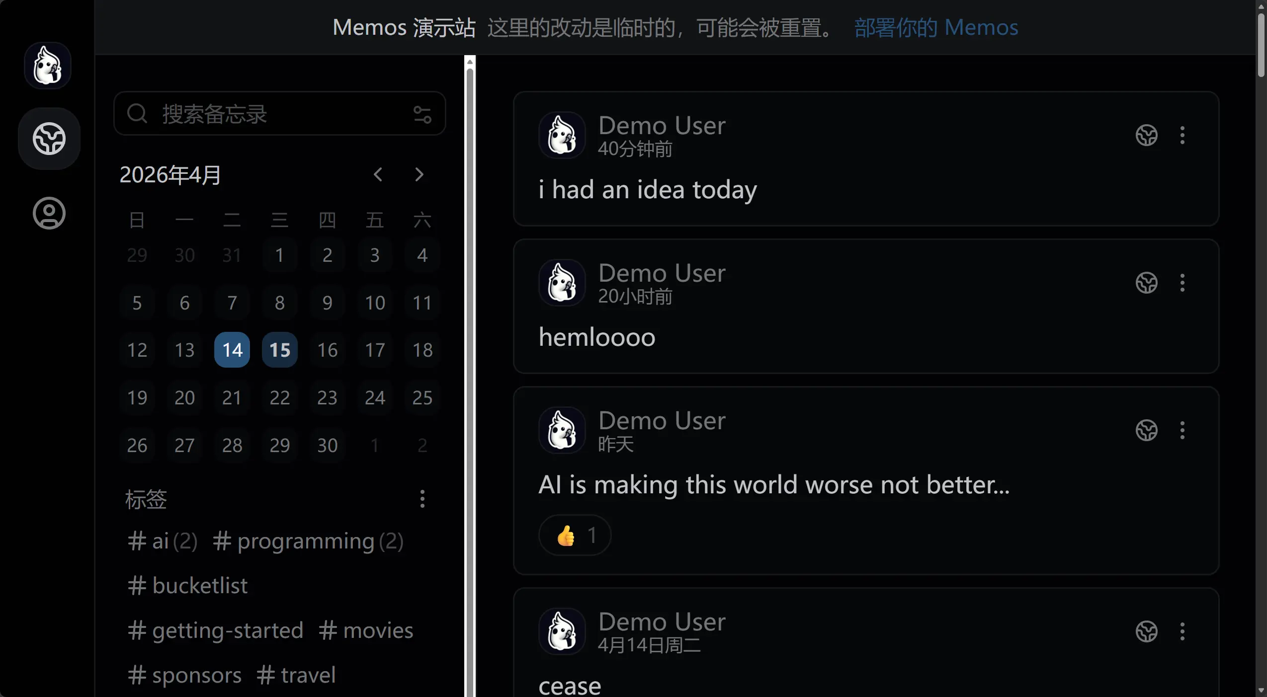
比如 Memos, Memos 是一款很有趣好用开源的自由备忘录软件,前端设计得很现代精致,可惜黑暗模式下侧边栏的滚动条是白色的(见下图),这种割裂的设计顿时会让设计的优雅气质衰减。截至我在用的 0.26.0 版本,这个问题仍未解决。猜想应该是因为 Memos 维护了诸多主题的原因,不过有待考证。
Updated 2026-04-15
我给 Memos 提了一个 Issue: Dark themes do not set
color-scheme, causing native browser UI elements such as scrollbar to stay light · Issue #5839 · usememos/memos。可惜下午满课,手边没有电脑,没法水个 pr。但是这个问题确实在 chore: set native color scheme for dark themes by boojack · Pull Request #5840 · usememos/memos 中解决了,还是很快速的。哎,不过我似乎并不打算更新 Memos 的版本,所以只为服务后人了...(其实并非,我们可以通过简单的自定义代码解决这个问题,见下面提到的解决方案)
要解决类似的问题,其实只需要让 color-scheme 跟随 .dark 类的变化就行,例如:
:root {
  color-scheme: light;
}
:root.dark {
  color-scheme: dark;
}
Updated 2026-04-15 针对上面 Memos 的案例,Memos 的开发者利用 Codex 巧妙的修复了这个问题,首先判断是否是黑暗模式:
const isDarkTheme = (theme: ResolvedTheme): boolean => {
  return theme.endsWith("-dark") || theme.endsWith(".dark");
};

/**
 * Updates the browser native control color scheme to match the current theme.
 */
const updateColorScheme = (theme: ResolvedTheme): void => {
  document.documentElement.style.colorScheme = isDarkTheme(theme) ? "dark" : "light";
};
根据是否是黑暗模式更新 DOM 的 colorScheme,如果是,就设置为 dark,反之为 light。
另外,Memos 的前端使用 React Router 构建,它们的 /utils/theme.ts 对于主题加载的函数也很值得学习:
export const loadTheme = (themeName: string): void => {
  const validTheme = validateTheme(themeName);
  injectThemeStyle(resolvedTheme);
  setThemeAttribute(resolvedTheme);
  updateThemeColorMeta(resolvedTheme);
  updateColorScheme(resolvedTheme);
  setStoredTheme(validTheme); // Store original theme preference (not resolved)
};
根据主题按需注入主题 CSS -> 设置主题偏好 -> 更新 Meta 颜色元数据 -> 更新 colorScheme -> 持久化到本地存储,这也是很不错的最佳实践。
当然,如果您使用的是旧版 Memos,仍然可以通过注入自定义脚本来监听并及时更新 color-scheme 状态,这很简单,只需要去 Settings -> System -> Additional script 添加下面的代码就 ok :
(function() {
    const isDarkTheme = (theme) => {
        return theme === "default-dark" || theme === "midnight";
    };

    const updateColorScheme = (theme) => {
        const scheme = (theme && isDarkTheme(theme)) ? "dark" : "light";
        document.documentElement.style.colorScheme = scheme;
    };

    const applyColorScheme = () => {
        const currentTheme = document.documentElement.getAttribute("data-theme");
        updateColorScheme(currentTheme);
    };

    applyColorScheme();


    const observer = new MutationObserver((mutations) => {
        for (const mutation of mutations) {
            if (mutation.attributeName === "data-theme") {
                applyColorScheme();
                break;
            }
        }
    });
    observer.observe(document.documentElement, { attributes: true });

    window.addEventListener("load", applyColorScheme);

    setTimeout(applyColorScheme, 1000);
})();
在某种程度上,prefers-color-scheme 和 color-scheme: light dark; 仍然是最优解,因为我们可以完全依靠浏览器的原生能力而不是繁杂的 JavaScript 脚本来控制这个极其细微的细节。一般来说,用户使用了深色主题,它们在访问网站的时候,往往需要的是一个同样舒服的深色主题,而不是选择手动切换到可能亮瞎眼的浅色模式。某种程度上,如果不是像 Memos 那样维护其它例如 Paper 这样的暖色主题(区分于 light/dark 模式),主题切换按钮往往也是没有必要的、甚至是过度设计的(over-designed)。
所以,下次设计用户界面的时候,不妨先思考一下:用户真的需要手动切换主题吗?或者说,您认为用户反复的手动切换主题对它们来说也算是一种乐趣。如果是后者,那么设计一个按钮、维护一些 JavaScript 也无可厚非,但是如果用户觉得这没必要,那还是删除比较好,毕竟,少即是多嘛。